As people's requirements for the quality of printed matter are getting higher and higher, four-color printing can no longer meet the public's requirements for color in some aspects, so spot color printing has become popular.
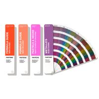
When it comes to spot color, we have to mention the PANTONE standard. The PANTONE spot color library is embedded in the image processing software Photoshop and Illustrator. At the same time, the spot color libraries used by many digital proofing software that support spot colors are also PANTONE standards.
PANTONE Color Matching System (PANTONE MATCHING SYSTEM) is a color communication system covering printing, textiles, plastics, drawing, digital and other fields. Enterprises and ink manufacturers provide fast and convenient color schemes and color standards.
Benefits of Using the PANTONE Standard
(1) Color expression and transmission are simple.
Customers anywhere in the world just need to specify a PANTONE color number, and we only need to check the corresponding PANTONE Color Chart to find the color sample of the desired color and make products according to the color required by the customer.
(2) Make sure that the hue of each printing is consistent.
Whether it is printed multiple times in the same printing factory, or printing the same spot color in different printing factories, it can be kept consistent without color cast.
(3) There is a lot of room for choice.
More than 1000 kinds of spot colors allow designers to have enough choices. In fact, the spot colors usually used by designers only account for a small part of the PANTONE Color Charts.
(4) There is no need for the printing factory to match colors by itself, which saves the trouble of color matching.
(5) The hue is pure, pleasing to the eye, bright and saturated.
All the color samples of the PANTONE color matching system are uniformly printed in the self-owned factory of PANTONE headquarters in Carlstadt, New Jersey, USA, which can ensure that the PANTONE color samples issued all over the world are completely consistent. Moreover, due to the complexity and particularity of its production process, no one has heard of imitation or counterfeiting so far. After nearly 40 years of development, PANTONE's products are widely used all over the world. It can be said that the PANTONE color matching system is used wherever color communication is required. Therefore, the PANTONE color matching system is an important tool required in international trade.
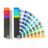
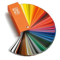
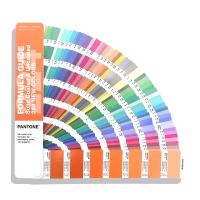
PANTONE Spot Color Formulation Guide
PANTONE standard Color Chart coated paper-offset paper (PANTONE formula guide coated/uncoated) is the core of the PANTONE color matching system, and is a commonly used PANTONE product with a large circulation. This article hopes to provide a little reference for users who use PANTONE spot Color Charts by interpreting the 2004 edition of the spot color formula guide.
The PANTONE Color Chart has a total of 1114 spot colors marked, and all colors are marked with a unique number and suffix. The following takes the spot color printed on coated paper as an example to give a specific description of each part of the Color Chart.
1. PANTONE Basic Colors (PANTONE Basic Colors)
This section includes 14 basic PANTONE colors, these 14 basic colors
It is a pure primary color ink, which is formulated with a single pigment (or color material) at a relatively high percentage. It has extremely high color concentration and color purity, and is the basis for blending other spot color inks.
2. PANTONE four colors (PANTONE ProcessColors)
This section lists the PANTONE four-color CMYK. The PANTONE four-color system is a CMYK-based color specification system launched by PANTONE, which indicates more than 3,000 colors according to the color ratio of CMYK.
3.PANTONE Hexachrome
This is a color matching system designed for high-fidelity color (Hi-FiColor) in recent years. It is composed of CMYK four colors plus spot color orange and spot color green, a total of 6 colors, which can match about 90% of PANTONE spot colors , so that the effect that needs to be achieved with many spot colors in the past can now be achieved with a combination of 6 colors. High-fidelity six-color is a complete comprehensive system, and can be used with popular software products and proofing systems to create a new wide color gamut.
4. PANTONE popular color
This part of the spot color is the commonly used PANTONE color, the color is bright and pure. Most of the company's logo colors can be found in this section. One of the spot colors is listed here for explanation, as shown in Figure 1.
The ink mixing formula is expressed in parts and percentages, and all colors that can be simulated by CMYK four-color overprinting are printed with signs. Most of the spot colors in this part cannot be obtained by CMYK four-color simulation.
5. PANTONE gray and dark tone series
This part of the spot color is a complement to the bright tone spot color. Most of the spot colors can be obtained by CMYK four-color simulation.
6. PANTONE light tone series
This section is a collection of spot colors designed for soft color effects. About 85% of the spot colors can be obtained by CMYK four-color simulation.
7. Designers use color
These colors reflect the designer's requirements for spot colors, the development trend of spot colors and the growth of color families. Nearly 80% of the spot colors can be simulated by CMYK four-color.
8. Fluorescent and metallic colors
There are 14 fluorescent colors and 14 metallic colors included. It is conceivable that all these 28 colors cannot be obtained by CMYK four-color simulation.
The 2004 edition of the spot color formula guide is a PANTONE spot color printed on offset paper, and the spot color sequence of each part is the same as that printed on coated paper. What needs to be explained here is that PANTONE256C and PANTONE256U represent the same spot color ink, that is, PANTONE256 is the only one. PANTONE256C means the effect of printing PANTONE256 on glossy coated paper. Its corresponding standard should be the spot color guide Color Chart of glossy coated paper, while PANTONE256U means the effect of printing PANTONE256 on offset paper or special paper. It corresponds to The standard should be a spot color guide card for offset paper.
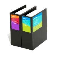
The colors on the spot color guide may fade or change color, in order to ensure accurate color delivery, it is best to replace this spot color guide every year. Generally, the sales points of PANTONE spot Color Charts have a trade-in business. The current new version of the PANTONE standard Color Chart is the 2005 version of the coated paper-offset paper package. The printing paper of the new version of the Color Chart is brighter and whiter than the previous version, so the color is cooler than the 2004 version, especially the light color blocks are more obvious. The use of split binding objectively enables customers to purchase both at the same time and one of them separately.
As early as 40 years ago, some people realized the importance of ink color uniformity in printing, and thus founded the American PANTONE company, which specializes in the standard research and popularization of printing colors. So far, it has been extended to many fields such as textiles and plastics, especially in the printing field. The PANTONE standard has been widely adopted by designers and printing people all over the world. Generally, foreign countries are accustomed to using PANTONE standard spot colors for printed matter, so as to ensure the uniformity of printed matter color, and it is becoming more and more popular and adopted in CHINA.