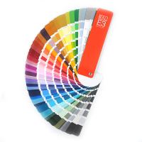
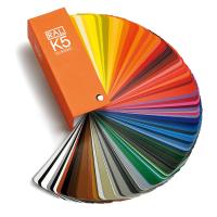
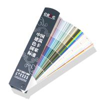
How long has your Color Chart been used? How long has your Color Chart not been updated? If you haven't updated your color booklet for several years, your colors are no longer fully marketable, accurate and reliable. why? The reasons are as follows:
1. Aging Effect: Is my color correct?
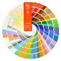
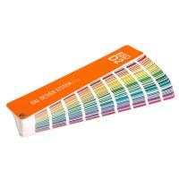
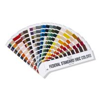
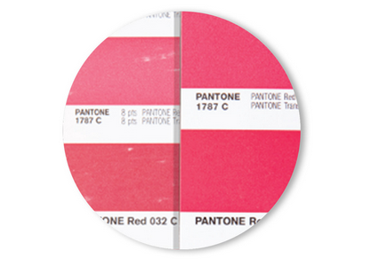
As a paper product, the Color Chart will inevitably have an aging effect after long-term use. Everyday use and exposure can make color inaccurate. Whether it is a general brand Color Chart or a standard Color Chart of an international brand (such as Pantone Color Chart), it is the same. No matter how high-quality a Color Chart is, it cannot last forever.
Colors will change over time due to exposure, fading, and aging. What factors have affected it? analyse as below:
1) Contact = Natural oils from fingertips will smudge and remove pigment
2) Paper rubbing = scratching or removing pigment
3) Light damage = fading
4) Paper aging = yellowing effect
5) Environmental humidity = accelerate paper aging
Therefore, it is recommended to update the guidelines every 12 to 18 months according to the usage and storage habits.
2. Guidelines for production: Are my suppliers and I looking at the same color?
One of the biggest frustrations when designing is getting the colors right during the remake. We've all been there. Why is it so difficult? There are many reasons and most likely your production partner is using an old guide.
If your guide is new and the printer's guide is a few years old, your colors will not match exactly, which can cause:
1) Miscommunication (eg: "Why can't they match my color?")
2) Frustration (e.g. "The brand rejected the sample again.")
3) Unnecessary reproduction (eg: "We cannot accept this sample, please resend it.")
4) The cost of shipping samples (Example: "Please send by express mail, the final samples should have arrived three weeks ago.")
5) Lost time (for example: "If the sample review fails, we will miss the launch date.")
6) Unsatisfactory (for example: "The brand owner rejected the sample again.")
7) Last but not least, accepting reluctantly (e.g. "This is as good as we can get.")
So if you use Color Charts to specify or approve colors with design or production partners, you may need to encourage them to keep updating the Color Charts in their hands (for example, buy new Color Charts at the same time as you).
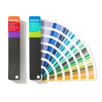
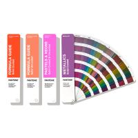
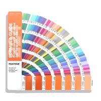
The use of Pantone Color Charts will also cause color accuracy problems due to aging effects and whether they are consistent with the manufacturer's Color Charts. Pantone has proposed a solution to this problem. Pantone's spot color chip set is for sharing colors . And design, which presents 1867 PANTONE MATCHING SYSTEM® spot colors in perforated form, can be provided to suppliers along with design specifications.
If you are worried that the production partner's Pantone Guide is not up-to-date, Pantone also recommends attaching Pantone SOLID CHIPS to the design artwork to ensure color accuracy.
Pantone Spot Color Chips claim to be a great tool for communicating color because:
Attached to the design artwork file, the specified color can be seen at a glance
Easy to ship and share colors
Let the printing factory have a solid color presentation that can be referred to for printing
Each color is sold in multiple chips for easy replenishment
3. Pantone colors are constantly being enriched and updated
In 2010, Pantone launched the Pantone PLUS series [PANTONE PLUS SERIES] products - a more modern version of the Pantone Matching System® [PANTONE MATCHING SYSTEM®]. After that we add new colors about every two years.
A common request for color in the design world is more colors. Designers should have asked for more color.
Because it means:
more expressions
more choices
more changes
more accurate presentation
More Unique Color Palettes
more fun!
Market-oriented, in line with fashion, with good looks?
New colors, new possibilities!
Pantone launched another 112 new colors in March 2016, which not only reflect the current situation but also read the future, allowing designers to have a greater scope and freedom. Having the right color to choose from is a requirement when making a lottery decision.
Color catches our attention
Color is a single important design element that reflects atmosphere and style
In today's visual world, establishing the right color palette is more important than ever to success
Consumer responses to color, especially in packaging and consumer products, are psychologically proven.
Conveying a strategic message with an accurate color strategy is critical
In Pantone's new line of global color communication tools find:
All 1867 Pantone Solid Colors [Solid PANTONE Colors]
Collaborate with major brands to develop relevant colors for contemporary packaging needs
Emphasize specific color ranges derived from market demands.
112 new ways to be more creative, inspired and expressive through color
Can't get enough of your colors?
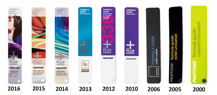
Since Pantone launched the Pantone PLUS series in 2010, it has added new colors three times. Check out the table below to find out - you may be missing over 750 colors!
| New color launch year | number of new colors | All spot colors | Number of colors missing from your existing guide |
| 2010 | 224 | 1341 | If you haven't updated in more than 6 years - 756 colors are missing |
| 2012 | 336 | 1677 | If you haven't updated in 5 years - 532 colors are missing |
| 2014 | 84 | 1755 | If you haven't updated in 3 years - 196 colors are missing |
| 2016 | 112 | 1867 | If you haven't updated in 2 years - 112 colors are missing |
in short…
Remember: Swatches fade and color guides age, meaning you don't really see the colors you designed and referenced. Users are advised to update the guidelines every 12 to 18 months.
Communicate with your production partner: even if you have a new Color Chart guide, who knows how long your production partner has used the same Color Chart. Ask your partners to update the guide every year, and if using Pantone colors, it is recommended to provide them with colors from the Pantone Spot Color Booklet.