When you think "red", what do you think of?
Maybe you think of deep red, like crimson, or bright red, like a stop sign. In the world of print, it's not enough to just say "red". There are even subtle differences between hues and shades, which brings us to the Pantone Matching System (PMS) - a global "language" for understanding and matching colors.
History of the Pantone Matching System
How can you be sure that both printers will create the exact same version using your logo and the exact hues and colors in your packaging?
The Pantone Matching System (PMS) does just that. Pantone set out to create a system that would allow for a consistent color numbering system, since printing colors often vary when using CMYK.
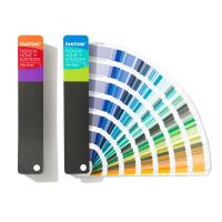
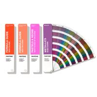
In PMS, it is possible to dedicate an entire worksheet to a single color in various subtle shades and variations. Several of them can be combined to form a "fan". They are coded by numbers, allowing print designers, no matter where they are located, to standardize their prints and match colors accordingly.
Two Pantone matching systems
Pantone actually has two different matching systems: one for packaging design and one for product design.
In total there are almost 5,000 Pantone colors. The reason for splitting the color system in this way is to allow for what Pantone calls "market-relevant colors." For example, product designs may use different shades of black, white, or neutrals, while retail packaging may require colors that stand out on the shelf and grab the attention of shoppers.
One more thing to remember: the appearance of a color will depend on the material it is printed on.
Depending on the material, some colors won't show up at all, or they'll look awful and not at all what the product creator intended. That's why Pantone decided to split their PMS into two different systems so that print and graphic designers not only know which colors can be reproduced on which materials, but also that they will show up well when printed.
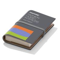
Pantone Matching System (PMS) Color Palettes

Depending on what you're printing, there may be a PMS palette that will match.
For example, there is a Pantone solid palette, a craft palette, a textile palette, and a plastic palette. You need to think about what you're printing to determine which colors you can use and which you should avoid.
There are many benefits to using a PMS. Most notably, since it's the most commonly used color matching system in the world, you can take your printed materials almost anywhere to reproduce them, and the printer can easily match those colors to their Pantone color codes - consistent results guaranteed.
Also, PMS has a great color range. While there are other systems, none of them can match the accuracy and precision of the Pantone system. Pantone's system is so popular that each year a new color is chosen to represent that year. Vibrant names like "Tangerine Tango" and "Mimosa" sound like flavored cocktails rather than colors. But when you stop and think about it, they really are like cocktails — eclectic concoctions that taste like your eyes.
What is the difference between PMS and CMYK?
In order to understand the difference between PMS and CMYK, it is important to first understand the difference between spot and process colors. Logos are examples of using spot colors. For example, the distinctive bright yellow of McDonald's golden arches is a specific Pantone color name or number that can be matched on press.
CMYK colors, on the other hand, are created using a mix between cyan, magenta, yellow, and black. Variations between printing presses and many other factors mean that, for example, one cyan color may not match another, which can lead to dramatic differences in color.
For example, that distinctive yellow color could look faded, or even dirty, depending on the printer, the press operator's experience, and any number of other issues. Depending on whether your printer is using digital or offset printing , this can also affect how your printed colors will end up looking.
CMYK colors are not guaranteed to be uniform across printers or even between print jobs, whereas Pantone colors are, as they can be selected according to specific, globally understood names or color codes.
Can you convert from Pantone to CMYK? Can you convert from CMYK to Pantone?
It can be done, however, it can be a challenge.
Graphic designers know that these two systems are distinct and complete, and that the same match cannot always occur. However, having said that, printing with Pantone inks can be expensive, and companies often prefer to use CMYK to help them save money, even if their logo is a slightly different color.
At the same time, Pantone has practically perfected assigning specific codes to the entire visible color spectrum, so companies that want to invest in an absolute fit and ensure good output at every stage of the process may want to switch their process from CMYK to Pantone.
If you want to convert from Pantone to CMYK or vice versa, Pantone sells a conversion guide that can help you find a match for your colors. You can simply open the swatches and convert the colors using a common graphic design program such as Adobe Photoshop or Adobe Illustrator.